This visual paradigm prioritizes aesthetics over content, creating a visually striking and often minimalist experience for users. In this blog post, we'll ...
1. Understanding Icon View
2. Advantages of Icon View
3. Common Use Cases
4. Comparison with Other UI Paradigms
5. Conclusion
1.) Understanding Icon View
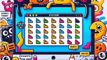
What is Icon View?
Icon view is a user interface design approach where the primary focus is on visual icons that represent various functionalities or content elements. Unlike traditional layouts that heavily rely on text labels, icon views use graphical representations of actions and objects to convey information at-a-glance.
Key Characteristics:
1. Visual Representation: Icons are symbolic images used to visually represent specific functions or items.
2. Minimalist Design: The interface is typically clean and uncluttered, allowing icons to stand out.
3. Focus on Aesthetics: While content is still present, the prominence of visuals makes aesthetics a central aspect of the design.
4. User Interaction: Icons are interactive; they can be clicked or tapped to trigger actions or access information.
2.) Advantages of Icon View
1. Intuitive and User-Friendly
Icons inherently provide a level of familiarity as everyone understands basic symbols (like a sun for 'brightness' in a settings menu). This reduces the learning curve significantly, making it easier for users to navigate without extensive training.
2. Space Efficiency
With icons taking up much less space than text labels, complex interfaces can be managed within smaller screen sizes or layouts where traditional navigation methods might not fit comfortably.
3. Aesthetic Appeal and Consistency
Consistent use of a set of icons across different platforms or applications helps in maintaining brand identity and user expectations. This visual consistency is particularly important for apps that are used by professional users who rely on intuitive interfaces.
4. Versatility
Icons can represent almost anything, from simple actions (like 'delete') to complex concepts (like a graph for financial data). Their versatility makes them ideal for diverse applications where the content might be different but the action remains consistent.
3.) Common Use Cases
Mobile Applications
Mobile apps are prime candidates for icon views due to the limited space available on screens and the need for quick interactions. Apps like Instagram, Facebook, or Twitter use a heavy dose of icons in their mobile interfaces to provide visual cues without cluttering the screen with text.
Dashboard Interfaces
In enterprise software, dashboards often utilize an icon view where multiple widgets are represented by icons that users can interact with directly. Examples include popular business tools like Salesforce or HubSpot.
Web Applications
For web-based applications targeting professional or creative users, icon views are used to present a clean and uncluttered interface without the distraction of text labels. Tools like Figma, Adobe Suite, or Trello use icons extensively in their interfaces.
4.) Comparison with Other UI Paradigms
1. Grid View vs Icon View
While grid view organizes content into a matrix of images or small previews, icon views focus on full-sized icons that are interactive and convey significant information at once. Grids can be used to display multiple items in an orderly manner, but they do not provide the same level of direct interaction as icons do.
2. List View vs Icon View
Lists organize content into vertically scrolling rows of text or minimal info, while icons enable users to scan visual representations for quicker understanding and decision-making. Lists are more text-centric, whereas icons encourage a broader, pictorial approach.
3. Flat Design vs Icon-Based Design
Flat design focuses on eliminating distractions by using simple shapes, colors, and typography without extra elements like shadows or gradients. Icon-based designs further refine this by replacing visual complexity with a focused icon library that represents functionality clearly without text labels.
5.) Conclusion
Icon view is more than just a UI trend; it's a deliberate approach to interface design that prioritizes aesthetics over content, making it particularly suitable for modern mobile and web applications targeting quick interactions and clear visual communication. Whether through the strategic use of icons in grid layouts or as standalone interfaces, icon views offer a distinct user experience that is intuitive, efficient, and visually appealing. As technology continues to evolve, the role of visual design elements like icons will only become more critical in crafting engaging and effective digital experiences.
The Autor: / 0 2025-03-30
Read also!
Page-

The Most Underrated File Explorer Feature No One Talks About
Among these, Windows File Explorer remains a staple for navigating and managing files on both PCs and laptops running Windows OS. Despite its ...read more

The Hidden Costs of Poor File Relocation.
However, many users overlook the importance of proper file relocation, which can lead to hidden costs that impact both personal workflows and ...read more
System Folders: Why You Shouldn’t Modify Them
When it comes to managing files on your computer, understanding where certain important system folders reside can be crucial. These system folders, ...read more
